
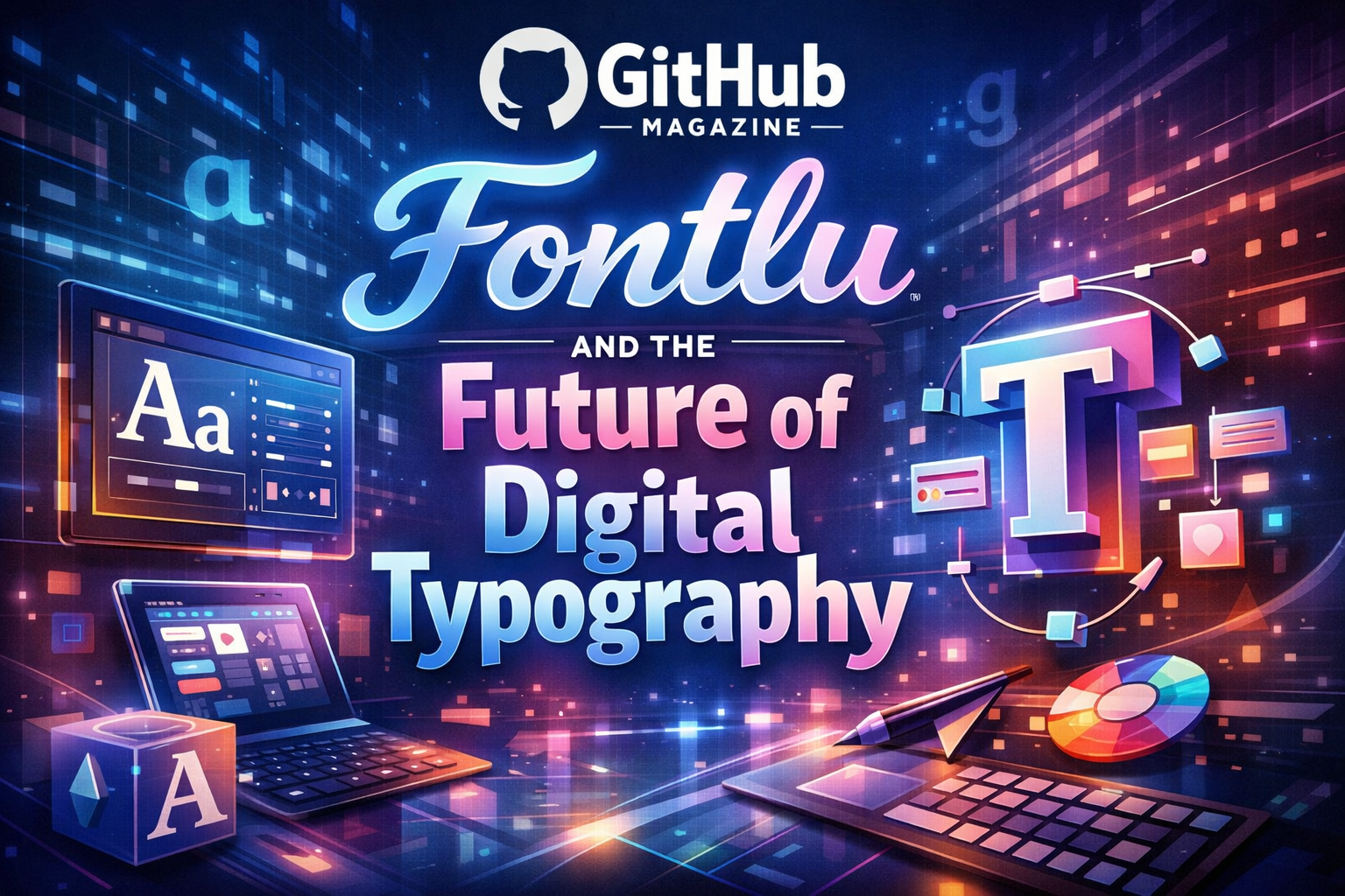
Fontlu and the Future of Digital Typography
Fontlu has entered the vocabulary of digital designers at a moment when typography is no longer a background detail but a strategic tool shaping how information is read, trusted, and remembered. In practical terms, Fontlu refers to a modern online ecosystem for discovering, previewing, organizing, and applying fonts across creative projects. For branding teams, interface designers, publishers, and independent creators alike, it represents an answer to a persistent question: how to choose and manage type in a world saturated with visual content and shrinking attention spans.
Within the first few years of the 2020s, design workflows became more collaborative, more remote, and more dependent on cloud-based tools. Fonts, once stored locally in messy folders or purchased through scattered marketplaces, began to migrate into centralized platforms promising speed, consistency, and creative clarity. Fontlu belongs to this new generation. It offers a single environment where users can browse thousands of typefaces, test them instantly with custom text, compare alternatives side by side, and download or synchronize choices across devices.
Typography, often described as the “voice” of visual language, shapes how audiences interpret credibility, tone, and emotion before they read a single sentence. A legal document set in a playful script would feel absurd; a children’s book printed in dense serif blocks would feel cold. Fontlu positions itself at this intersection of psychology, aesthetics, and technology. It does not simply store fonts. It organizes meaning.
This article examines what Fontlu is, how it functions, and why it matters. It places the platform within the longer history of typography, explores its technical structure and cultural reception, and evaluates how tools like it are quietly redefining the way modern communication is designed.
Contextualizing Fontlu in Typography’s Long History
Typography predates the digital world by centuries. From the movable metal type of Johannes Gutenberg’s fifteenth-century printing press to the industrial standardization of fonts in the nineteenth century, the shape of letters has always reflected available technology and cultural values. Early typefaces were designed to imitate handwriting. Later, they became symbols of authority, modernity, or rebellion depending on their form.
In traditional printing, a “font” referred to a specific physical set of metal characters in a single size and weight. A typeface such as Garamond or Baskerville existed as an idea, but each font was a physical object stored in drawers, heavy and limited. Digital publishing transformed this system. Fonts became files. Typefaces became scalable families with dozens of variations: thin, bold, condensed, italic, extended.
This explosion of choice created a new problem. Designers suddenly had access to thousands of fonts but little structure for navigating them. File systems were not built for aesthetic decisions. Searching by mood, historical style, readability, or brand personality required experience and intuition more than technical support.
Fontlu enters at this point in history. It treats typography not as static data but as a living design language. By categorizing fonts according to visual tone, use case, and emotional character, it continues a centuries-old effort to make letters legible, meaningful, and culturally relevant, now translated into software.
What Fontlu Is and How It Works
At its core, Fontlu is a web-based platform dedicated to font discovery and management. Users access a structured library containing thousands of typefaces, both free and commercially licensed. Instead of scrolling through endless lists of file names, they interact with a visual interface that displays how fonts behave in real text.
A designer entering the platform can type a headline, paragraph, or slogan into a preview box and immediately see it rendered in different styles. Filters allow narrowing by serif or sans-serif, geometric or humanist, modern or vintage, formal or playful. The system replaces guesswork with comparison.
Beyond browsing, Fontlu supports organization. Users can save favorites, create collections for specific projects, and maintain consistency across branding campaigns. Some versions of the platform also support cloud synchronization, allowing teams in different locations to work from the same typographic palette.
The philosophy behind Fontlu is simple: typography decisions should be creative, not administrative. By removing technical friction, the platform shifts attention back to visual storytelling.
Key Functional Components
| Component | Purpose |
|---|---|
| Font Library | Centralized collection of free and premium typefaces organized by style and usage |
| Real-Time Preview | Instant rendering of custom text in selected fonts |
| Advanced Filters | Sorting by category, weight, mood, and application |
| Font Pairing Tools | Suggestions for complementary headline and body fonts |
| Cloud Sync | Access to saved fonts and collections across devices |
User Experience and Creative Workflow
Design work often oscillates between inspiration and frustration. A layout may look perfect except for the type. Hours can be lost testing small variations in spacing or weight. Fontlu attempts to shorten this cycle.
For beginners, its interface functions as an educational tool. By experimenting with different styles, new designers begin to recognize how subtle changes influence tone. A thin sans-serif conveys elegance and restraint. A heavy slab serif suggests stability and tradition. The platform becomes a classroom without lectures.
For professionals, efficiency matters. Branding projects require consistency across packaging, websites, advertising, and documentation. Fontlu’s saved collections allow teams to standardize fonts and reduce accidental deviations. Designers can ensure that a logo font used in a brochure matches the one used on a website banner.
The platform also supports experimentation. By placing fonts side by side in real-time previews, it encourages visual comparison instead of abstract speculation. Typography becomes tangible, immediate, and less intimidating.
Increasingly, platforms like Fontlu incorporate artificial intelligence. By analyzing user behavior, project categories, or trending design styles, the system can suggest fonts likely to fit a given purpose. While such recommendations never replace human judgment, they act as creative prompts, expanding the range of possibilities considered.
The Psychology of Type and Fontlu’s Design Logic
Fonts speak silently. Readers rarely articulate their reaction to type, but they feel it. Studies in cognitive psychology and design research have shown that typography affects perceived trustworthiness, authority, and emotional warmth. Legal contracts often use conservative serif fonts because they signal seriousness. Technology startups favor minimalist sans-serifs to project innovation.
Fontlu’s structure reflects this psychological dimension. Its categories are not purely technical. They include descriptors related to mood and identity: “friendly,” “corporate,” “editorial,” “playful,” “luxury.” This vocabulary bridges the gap between artistic instinct and software logic.
By organizing fonts in this way, Fontlu transforms a subjective process into a guided exploration. It does not dictate choices but contextualizes them.
Common Font Categories and Typical Applications
| Category | Typical Applications |
|---|---|
| Serif | Books, newspapers, academic publications, formal branding |
| Sans-Serif | Websites, mobile apps, technology products |
| Script | Invitations, logos, decorative headlines |
| Display | Posters, advertising, large headlines |
| Monospace | Coding interfaces, technical documentation |
Expert Perspectives on Modern Typography Tools
Typography scholars and practitioners frequently emphasize that type design is inseparable from cultural context.
Design educator Ellen Lupton has described typography as the “interface of language,” arguing that letters mediate between abstract meaning and physical perception. To her, choosing a font is akin to choosing a tone of voice in conversation.
Type designer Tobias Frere-Jones has similarly noted that well-designed fonts disappear into reading when they function correctly. Their success lies in being unnoticed, allowing content to flow without distraction.
User experience researcher Jared Spool highlights typography’s role in comprehension. He argues that poorly chosen fonts slow reading speed and increase cognitive effort, subtly exhausting users long before they recognize the cause.
Fontlu positions itself as a response to these insights. By simplifying access to appropriate fonts and encouraging thoughtful pairing, it seeks to reduce the hidden friction that typography can introduce into digital life.
Fontlu Within the Broader Digital Design Ecosystem
Fontlu does not exist in isolation. It belongs to a constellation of modern design tools that prioritize collaboration, speed, and consistency. Vector design platforms, interface prototyping software, and website builders increasingly rely on shared asset libraries. Fonts are among the most critical of these assets.
Historically, font management software existed mainly as utilities buried deep within operating systems. Designers had to manually install, activate, and deactivate files to avoid conflicts. Fontlu shifts this burden to the cloud. Instead of maintaining local archives, users draw from a continuously updated library.
This model mirrors broader changes in software culture. Just as music streaming replaced physical CDs and cloud storage replaced USB drives, cloud typography platforms replace personal font hoards. Ownership becomes access. Maintenance becomes automatic.
Such platforms also respond to globalization. A design team might include members in London, Lagos, Karachi, and São Paulo. Shared font libraries eliminate discrepancies and ensure visual unity across borders.
Community, Culture, and the Name “Fontlu”
Interestingly, the term “Fontlu” has developed a secondary meaning beyond its function as a platform name. In online design forums and digital art communities, it is sometimes used as shorthand for experimental typography or innovative font culture.
Language often evolves this way. Brand names become verbs, then metaphors. Just as “Photoshop” once came to mean any form of image manipulation, “Fontlu” has begun to signify a mindset: open, exploratory, digitally fluent typography.
This cultural adoption suggests that typography itself is entering a new phase. Once considered a niche craft practiced by specialists, it is now part of everyday digital expression. Social media posts, presentations, personal blogs, and small business websites all involve typographic choices.
Fontlu benefits from this democratization. It lowers the barrier to entry while simultaneously serving professionals who demand precision.
Economic and Licensing Dimensions
Fonts are intellectual property. Each typeface represents months or years of design work. Historically, licensing has been complex, varying by medium, audience size, and distribution channel.
Fontlu simplifies this landscape by clearly labeling fonts as free for commercial use, restricted, or premium. Users can understand at a glance whether a font is suitable for a logo, a website, or printed merchandise.
This transparency benefits both designers and type foundries. Creators receive proper credit and compensation. Users avoid legal uncertainty.
The platform thus becomes not only a creative tool but a marketplace and regulatory framework, balancing accessibility with professional sustainability.
Accessibility and Readability
Modern typography must also address accessibility. Millions of people live with visual impairments, dyslexia, or cognitive conditions that affect reading. Fonts with poor contrast, irregular spacing, or decorative distortions can exclude these readers.
Fontlu’s categorization often includes tags related to readability and accessibility. Designers can intentionally choose fonts optimized for long-form reading or low-vision contexts.
As digital inclusion becomes a central concern in technology policy and ethics, typography platforms carry social responsibility. A well-chosen font can mean the difference between participation and exclusion.
Takeaways
- Fontlu centralizes font discovery, previewing, and organization in a single platform.
- It reflects a historical shift from physical type to cloud-based typography management.
- Real-time previews and pairing tools accelerate creative workflows.
- Typography influences trust, emotion, and comprehension more than most readers realize.
- Cloud libraries support global collaboration and design consistency.
- The platform balances creative freedom with licensing clarity and accessibility awareness.
Conclusion
Fontlu represents more than a convenient font catalog. It embodies a broader transformation in how visual language is produced, shared, and understood. Typography, once confined to printing presses and specialist studios, now shapes everyday communication across screens large and small. In this environment, the tools that organize letters quietly influence culture.
By reducing technical friction and amplifying creative choice, Fontlu shifts attention back to meaning. It allows designers to think less about file management and more about voice, tone, and identity. It acknowledges that fonts are not decorative afterthoughts but structural elements of understanding.
As digital communication continues to accelerate, the demand for clarity, inclusivity, and aesthetic coherence will only grow. Platforms like Fontlu, operating at the intersection of art and infrastructure, will increasingly define how stories are told visually. Their success will be measured not only in downloads or subscriptions but in the invisible ease with which readers move through text, unaware of the complex typographic systems supporting every sentence.
FAQs
What exactly is Fontlu?
Fontlu is a web-based platform for discovering, previewing, organizing, and downloading fonts for digital and print design projects.
Is Fontlu suitable for beginners?
Yes. Its interface allows users with little design experience to test fonts visually and understand differences without technical complexity.
Can Fontlu be used for commercial projects?
Many fonts are licensed for commercial use, while others require payment. Each font’s license information is clearly displayed.
Does Fontlu replace traditional font management software?
For many users, yes. Cloud-based libraries reduce the need for local installation and manual organization.
Why does typography matter so much?
Fonts influence readability, emotional tone, trust, and brand identity, shaping how information is perceived before it is consciously interpreted.
Related Posts
ATFBooru Review: Inside a Tag-Driven Imageboard

Streameast.ms Explained: Legality, Risks, Future